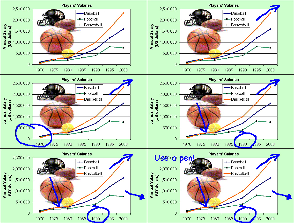
One of the most important things to do is get the main idea of the graph.
First, identify the main features of the graph. What is happening? What are the biggest numbers? If it is a time graph, what are the biggest changes? What are the trends?
Use a Pen!
Ideally you need to find one main idea and, if possible, one or two more smaller ideas.
- Don’t have too much information
- Don’t analyze or explain everything in the graph
- Don’t go from left to right, explaining everything. Instead pick the main ideas.
- Use the biggest and next biggest – don’t mention everything in between.
- Don’t mention the small or unimportant stuff
- Pick an idea and find information that supports it
Study the graph below. Print it out. Write on it. Circle the important points – beginnings, endings, sudden changes, low points, high points, trends, averages, differences between lines, differences over time.
The graph shows US sports players’ salaries in dollars.
In 1970, baseballers earned $125,000 a year, footballers’ salaries averaged $99,000 a year, and basketball players earned about $43,000 annually.
Main ideas
- All salaries increased
- Big differences between 1970 and 2000 for all sports
- Basketball was biggest in 2000, followed by baseball
- In 1970, basketball was the lowest, baseball was the highest
- There was a sudden rise beginning in 1980
- There was another sharp rise for all sports in 1990
- Salaries in football began to level off or even fall from 1995 onwards
Source: from The First Measured Century, by PBS.
